The design goal was to take a local business's logo that I personally felt was lacking, and redesign it with the knowledge and concepts learned from my studies.
Bowman’s Bar and Grill is a tavern-style bar established in downtown Ottawa, and I've chosen them for the logo makeover.
Research
Initial research was done on Bowman's itself to understand their target audience, demographic, psycho-graphic, and company reach. After those were established, I studied several nearby competitors to gauge competition and expectations of a redesign.
Before I started concepting and sketching, I needed to set some boundaries to stay within so the logo comes out right.
Colour, Scale, and Recognition
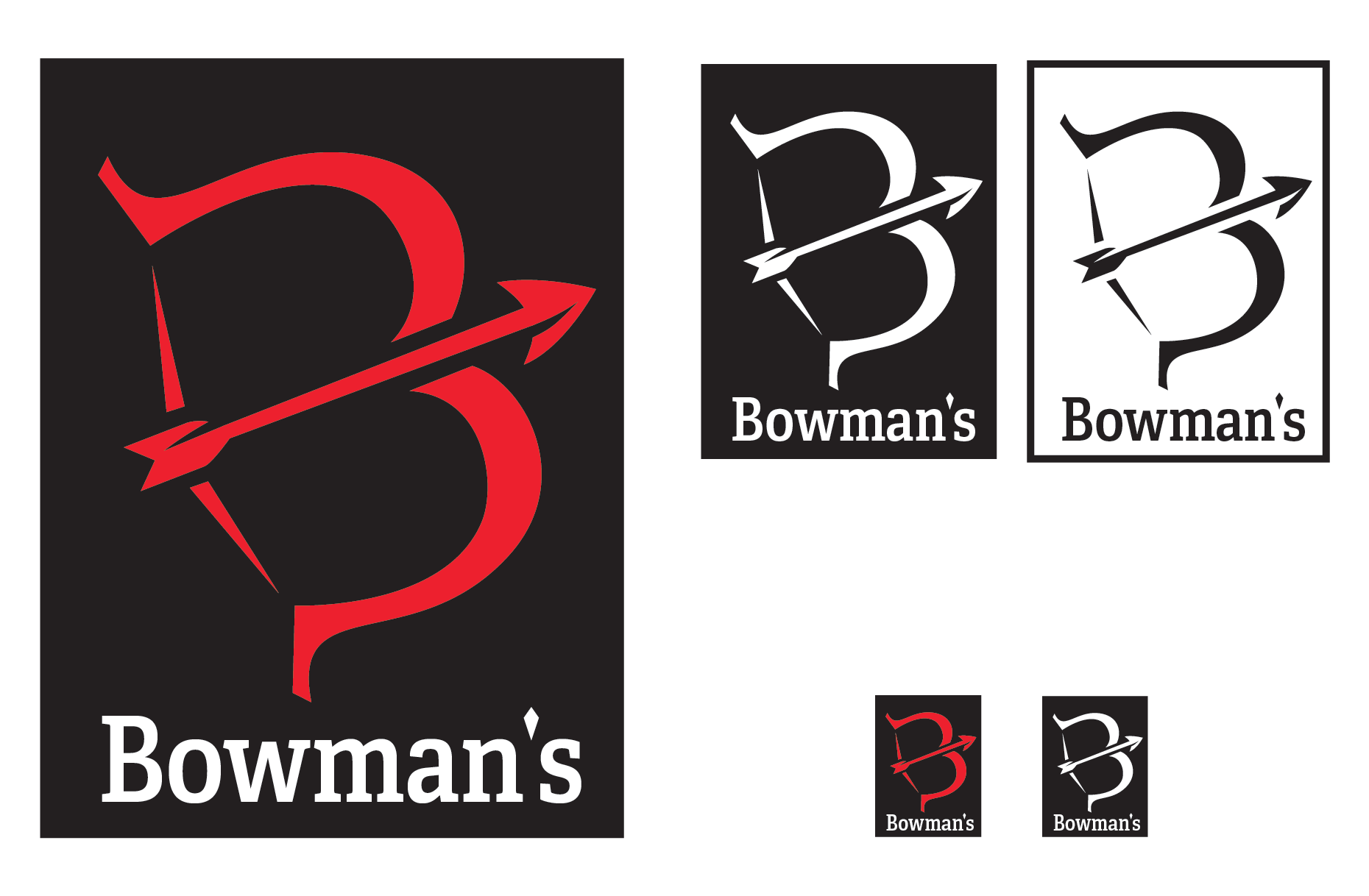
Red is the primary colour in their palette, so that must remain the same. The logo must be able to scale up and down to be presented on large buildings and small menus/coasters and remain readable. New logo must also be recognizable to current and previous customers as the same business to maintain established brand identity.
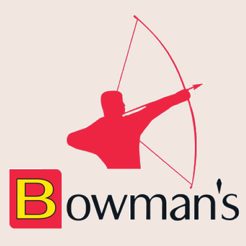
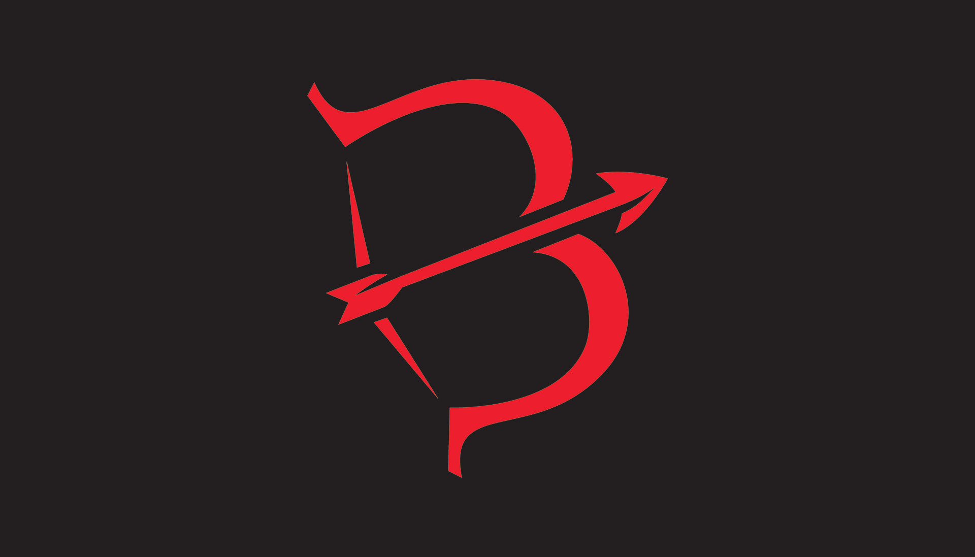
Original Logo
Design
The theme of Bowman’s resembles those of taverns found in medieval times, with a modern twist to stay relevant and competitive. Staying true to that theme, here are the design choices made for the logo redesign.
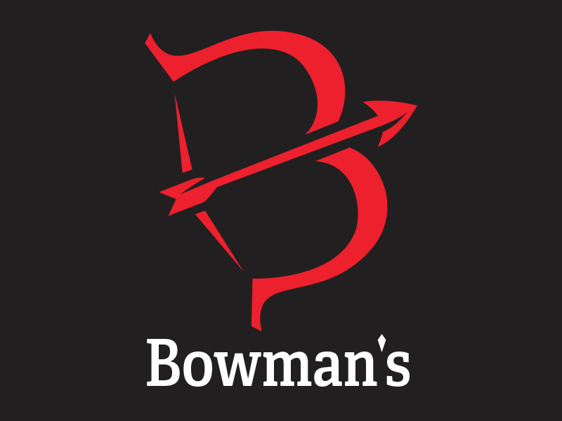
The original logo lacked proper contrast and strength to properly represent what Bowman’s really has to offer. The new logo is designed to resemble a bow, and equally depict the shape of a ‘B’, thus representing Bowman’s Bar and Grill in multiple unique ways. While staying true to the original theme, the new logo offers a modern twist to be easily recognizable and stand out with a more solid contrast.

The font choice is to resemble the original, while becoming more modern and readable. The font used is Adelle Condensed, as it offers strong readability, and a modern slab-serif style. The apostrophe is designed to resemble an arrowhead simply for aesthetic purposes.
The colour palette was to keep true to the original theme and emotion, while being updated for modern standards. PANTONE P 48-8 C was used, as it offers a slightly redder and more concentrated colour than the original. While the logo stands strong on its own, PANTONE P 179-16 U, or solid K, was chosen as the official complimentary colour to be paired with.
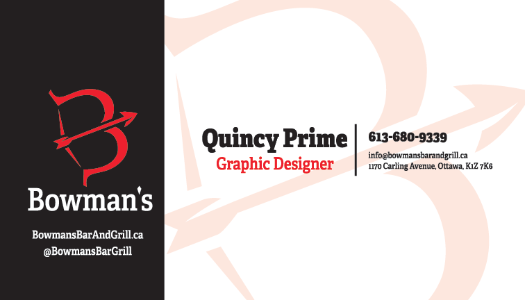
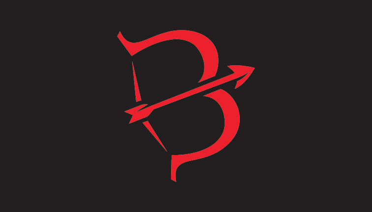
Final Product